Don’t you like a website that adapts your preferences, shows their products or services in captivating 3d format so you get a 360view and understand the product well before you purchase it? The designers are implementing the growing technology and crafting visually appealing elements for websites to attract the users. From dark mode to minimalism, these modern website designs are not only catchy and appealing but also user friendly enhancing the overall UI/UX experience and helping users navigate around the site easily. Let’s see a few trending and modern UI/UX trends you can’t miss for the year 2025!
Table of Contents
DARK MODE:
As the time spent on screen has increased, the users like the dark mode on sites as they reduce the strain on the eyes. Dark colours in websites not only reduces the strain on eyes but also provides a sleek and modern look to the site.
Netflix India is an example for the same. Few websites like Zomato and Flipkart provides an option of dark mode to the users.
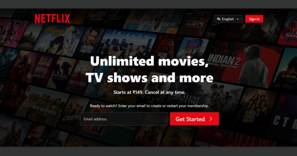
Dark doesn’t necessarily means using a black colour in background but using a colour which is dark (like dark shades of grey), warm (brown or burnt red) or cool (dark blue or green) to reduce the eye strain and increase readability.
MINIMALISM:
The main purpose of a website is to showcase their products or services. A clean and simple interface helps the audience to see what you want them to see. A minimal website will never be out of trend. As they say, “the ability to simplify means to eliminate the unnecessary”.

Google’s website is a great example of minimal website where the search bar is the only focus. Indian websites- Naukri and Clear tax are also a great example of this.
Focusing on content, limited colours and simple fonts can help you achieve a minimal and simple website.
3D ELEMENTS:
3D elements add a 3 dimensional look to your boring flat site. It also increases the SEO (Search Engine Optimization) of your website as users tend to stay longer and gives your website a modern look. 3D models also enables users to engage with products, allowing them to rotate and zoom which helps in increased orders.
This is very helpful to fashion, automobiles and furniture websites where the consumer would want to have a complete look before buying.
MICRO INTERACTIONS:
Interactive elements that reacts to user’s action make site feel more fun. Have you noticed the small arrows that appears when you hover your mouse on the ‘Schedule a free call’ or ‘view our work’ tab on Design Spectrum’s website? Those animations are called micro interactions/interactive elements.
Few more examples are:
When you hover over call or email tabs and they wiggle,
When you pay someone and once the transaction is complete it makes a little sound.
BOLD TYPOGRAPHY:
Bold typography can be used to highlight important information. In today’s time, where people scroll through so many sites and just skim to get a general idea of the content, bold typography can help you catch their attention.
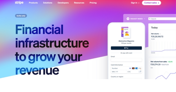
An example of this is Stripe where heading and other important information are highlighted using bold texts.
HEADERS:
Full page headers or image headers are trending these days. The main goal is to grab attention as soon as the user lands to the site. Usually such headers contains picture, text like brand name and few links and buttons.
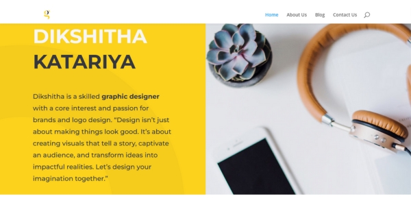
An amazing example of this is dikshitha katariya’s site.
Using animations on such header is also a great idea like when you open the site, the picture in the header zooms in.
FOCUS ON PERFORMANCE:
All of these trends are nothing if your site takes time to load. Bunty, tera site slow hai kya? Customers expect your site to load in seconds, if not, they tend to leave. It’s essential to spend more time on usability and performance so that customers can easily find what they are looking for.

As more users access the internet through smartphones, you need to ensure that your site is not only visually appealing but also incorporates responsive design to be user-friendly on small screens. Responsive design is crucial for adapting your site’s layout and content, making it easier for users to navigate and interact, regardless of the device they’re using.
CONCLUSION:
Website design in 2025 is all about prioritizing users experience and performance. Trends from 2024, such as increased emphasis on accessibility, aesthetic site, and interactive elements, will set the foundation for impactful designs. Keeping up with these trends will help to create impactful website that users resonate with. Check Awwwards for web designing inspiration.
