Color-Color: What Color Do You Choose?
NO, NO, NO! Don’t just pick a color randomly for your website. Think beyond the surface because color psychology in web design plays a huge role. It is not about what color is your favourite or what color looks pretty, it’s about what color resonates with your brand and emotional impact of colors on your audience. Colors you choose can influence emotions and even the success of your website. But..
What is color theory and color psychology in web design
Color psychology is how humans react or behave to different colors. It shows how a color can evoke emotions, influence decisions and impact experience. Color theory on the other hand helps in understanding which color combination looks good together or complement each other creating a balance and visually appealing look. So let’s explore and understand about color psychology in web design.
Table of Contents
Understand emotional impact of colors in web design
You might not always be able to express yourself in front of strangers, but did you know that colors can? Colors have the ability to evoke emotions and influence how people think and feel. Understanding color psychology in web design is crucial to create an experience that your audience would never forget. Let’s understand the feelings different colors evoke.
BLUE
Starting with blue is obvious because of it being the World’s favourite color. Yes, you read it right. Blue is the top pick of more than half of the people in the World. Even brands feel the same way. So many brands use blue in their logos, do you know why? Well because the color blue brings up a feeling of security, trust and reliability. It combines well with other colors, offering flexibility in web design.
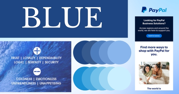
Which companies should use blue? Companies like finance, technology and corporate sectors.
PURPLE
Yes, even the trending color of 2024 – Lavender comes under this color family. Purple gives a feeling of luxury, royalty and imagination. Whereas the lighter shades of purple like lavender expresses relaxation, elegance and sophistication. Purple combines the stability of blue and the energy of red, which can make websites feel both calming and dynamic.
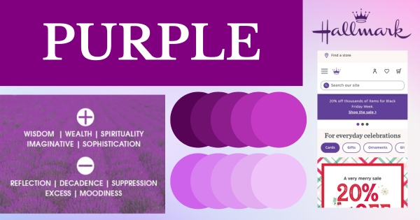
Which companies should use purple? Perfect for luxury brands, beauty companies and any creative brands.
RED
Did you notice so many energy drink companies use the color red? That is because the color red is associated with energy, excitement and passion. Well that’s not it, red also evokes feeling like hunger and negative feelings like anger and danger. In web design, red is a bold and attention-grabbing color that evokes strong emotions like passion, energy, and urgency. It is often used to create a sense of excitement or to highlight calls to action (like buttons or promotions), encouraging immediate user engagement.
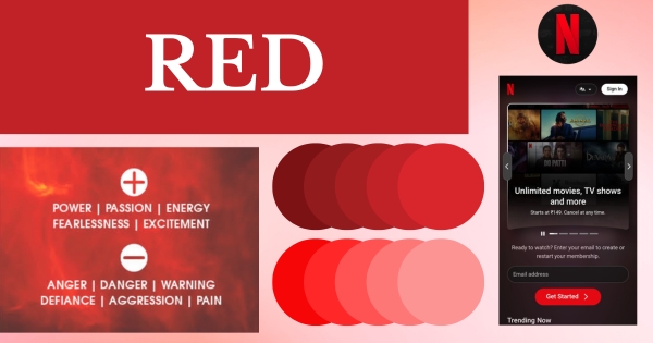
Which companies should use red? Food, entertainment and sports companies.
GREEN
Not being dramatic but green represents life. The color green expresses life, nature, freshness, health and hope. By incorporating green in logos, packaging, and websites, companies can visually align their brand identity with the values of eco-friendliness and sustainability.
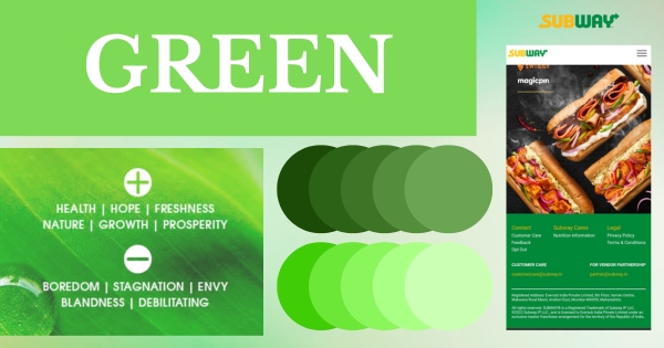
Which companies should use green? Health & wellness and Eco-friendly brands
YELLOW
Yellow-Yellow dirty fellow; sitting on the… Well NO, yellow is far from dirty! It’s one of the brightest, most attention-grabbing colors. Yellow symbolises Joy, optimism and playfulness. It’s the color of sunflowers and even smiley faces. Used correctly, yellow can create an impactful design filled with vibrancy and joy, making it ideal for brands that want to spread cheer. Even the character JOY in Inside out is yellow depicting her personality.
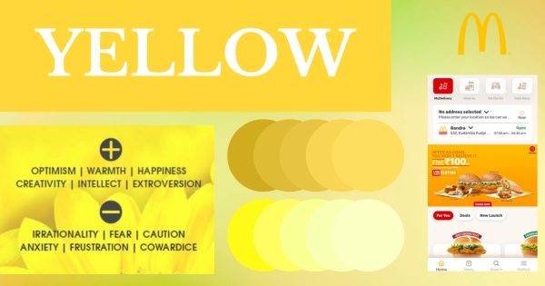
Which companies should use yellow? Food companies, entertainment industries and kids brands.
BLACK
It is the most versatile color. Black is a timeless color signifying power, mystery, luxury and authority. In web design, black is a color that adds a modern, sleek feel, while enhancing contrast and readability. When used strategically, black can help define a website’s tone, adding depth and drama, while maintaining a sense of professionalism and refinement.
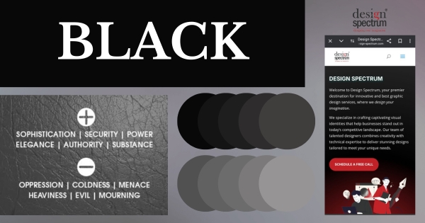
Which companies should use black? Tech companies, High end restaurants, music companies and photography studios
WHITE
Think white as plain? Well then think again because white is an empty canvas, ready to be filled with endless possibilities. It gives minimal vibes, sleek look and a sense of purity, openness and elegance. The color white enhances readability by providing contrast against other colors. It helps avoid the clutter therefore provides clarity and organised content. Overall, white is key to creating visually appealing, user-friendly website that is both functional and aesthetically pleasing.
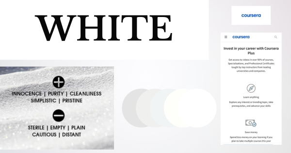
Which companies should use white? Luxury companies, education platforms, healthcare sectors and NPOs.
Create balance using color theory
Well now that you know about color psychology in web design, let’s dive into color theory. Color theory helps to understand which color will look great with the other. Using complementary colors or neighbouring colors can help you create a balanced look. Too much of a single color, like black, can create a dark feel. Pairing it with lighter tones like white or colors such as gold or red can bring balance and contrast. Use tools like Canva’s Color Palette Generator, Coolors, Colordot, and Paletton to experiment with perfect color combinations. Curious about the best color pairings for your website? Check out this blog for top color combinations for web designing.
Choose colours that align with your brand
As we have explored the emotional impact of colors. When selecting a color palette for your website, consider the emotions and values that each color evokes. It’s important to choose website colors that resonate with your audience and reflect your brand’s identity and message. For example, color green to reflect you are a sustainable brand. The right color palette helps communicate your brand’s personality, making it memorable and easy to recognise.
Guide and drive users using colours
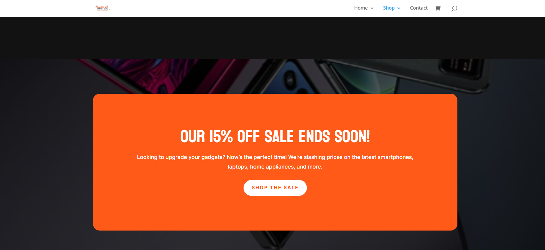
Colors can help you to guide and even drive your audience. Color psychology in web design is important because you can use highlighting and attention grabbing colors in your call-to-actions and special offers or sale section to create a sense of excitement. Strategic use of colors can drive users towards your desired actions. The image provided above from Balecha’s gadget guru is an example, they used bright orange color in their sale section to direct users. You can even improve the overall user experience and increase conversion rates while maintaining the overall visual appeal of the site.
Keep accessibility in mind
In addition to considering color psychology in web design when selecting colors, it’s equally important to keep accessibility in mind. It is important that the colors you choose is accessible to all users, including people with color blindness. Colour-blind people often have difficulty distinguishing between red and green, and sometimes blue and yellow. They can typically see colors like blue, yellow, and various shades of grey. Tools like the WebAIM about Web Content Accessibility Guidelines (WCAG) can help you evaluate your website’s color choices for accessibility, ensuring that all users can engage with your content.
Conclusion
Incorporating color psychology in web design is essential for creating an impactful and user-friendly experience. By understanding the emotional impact of colors and applying color psychology in web design, you can guide users, enhance engagement, and build trust. Thoughtful use of colors not only improves aesthetics and create an impactful design but also increases conversions, making it a key element in effective web design.

