
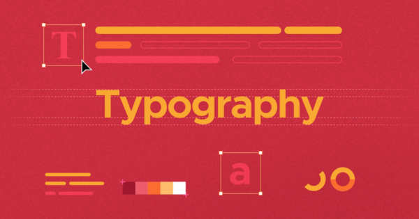
Knowing about Typography trends is crucial because text is the element viewers search for first to understand the context of the design. If it’s not done right, it can quickly turn into a ‘typo’ instead of a ‘type’. Typography is so much more than just a design element, it’s a powerful tool that communicates the message of your design. The fonts and the way they are arranged also impacts the overall message of the design.
Be it graphic designing, web designing, branding or marketing, typography is an essential part everywhere. Even in school, we all had that one friend with perfect handwriting, the one whose notebook everyone would borrow just to copy their neat notes. Well, just like those perfectly written notes good typography can make a design shine while communicating the message clearly. The font you choose also impacts the readability and the tone of your brand. So choose a font that aligns with your brand and the tone you want to express. Now let’s explore some of the most exciting typography trends in 2025.
Table of Contents
Emerging Typography Trends 2025
As technology and designs evolve, several typography trends are gaining popularity. These typography trends shows how creativity, functionality and personalization are changing the whole design game.
Custom fonts
Feel like the existing fonts in the library are too common, blah and doesn’t resonate with your brand? Well custom fonts can truly capture your brand’s personality and make your designs stand out. In 2025, one of the increasing typography trends will be the use of custom fonts. It will help the brands to create a more unique identity.
Even designers will be able to go beyond the limitations of existing font libraries. Custom fonts can help the brands and designers to create an identity that is even more clear and effective and helps to distinguish them from the competitors.
A great example of a brand who uses custom font is Zomato. The Indian food delivery app created their own custom font called Zomato Serif for its branding. They use it across their app, website and marketing materials. One more classic example is Coca-Cola. The iconic script font used in their logo is a custom font. With improved technology in font creation tools, this trend will only be growing more and more.
Interactive Typography
With the rise in use of interactive elements in websites and apps, interactive typography is set to be a major typography trend in 2025. Interactive typography is when the text changes or interacts when hovered over, scrolled or responds to users input in real time.
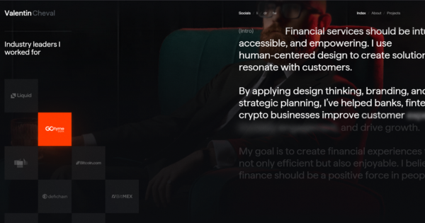
For example, take a look at the website of the finance designer Valentin Cheval. As soon as you enter the site, you will notice how interactive typography is used to showcase his categories of work. As you scroll down to the introduction section, the text adjusts and clarifies itself in real time creating a more engaging experience for the user.
This trend will basically bridge the gap between static and dynamic content and offer new ways to communicate the message.
Sans Serif Revival
Serif is the twin with all the extra accessories and flair while Sans-Serif is the chill one who shows up in a plain T-shirt and jeans. While serif font is favoured for printed materials, sans serif fonts are experiencing a rush in digital design, do you know why? Well that’s because these clean and modern typefaces are easy to read on screens. One more reason of this revival is the ongoing trend of minimal and simple designs. Sans serif fonts are simple, minimal and versatile than serif fonts.
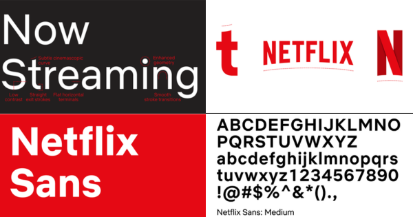
Sans serif fonts offer a modern and easy to read experience that many brands look for. A recent example of Sans Serif Revival is Netflix’s rebranding. They updated their logo, moving from serif font to sans serif typeface called ‘Netflix Sans’. This new font was a custom font, obviously! The move to a sans serif typeface helped Netflix enhance its digital presence making it more readable across a variety of devices while maintaining a modern, sleek aesthetic.
How to use Typography trends effectively
While the typography trends of 2025 offers various possibilities, it’s important to use them thoughtfully and not just because it’s trending. Here are some tips:
Align typography with brand identity
Typography is an important part of a brands identity. As discussed earlier, custom fonts can also be chosen to reflect the personality and values of the brand on a deeper level. The fonts you choose should align with the tone and purpose of the brand. For example, a luxury jewellery brand may go for an elegant serif font while a tech company might go for a clean sans serif font. Strong, bold font may convey confidence and authority whereas soft, rounded font may convey warmth and friendliness.
Prioritise readability
While creativity in typography is important, readability should always be the priority. Typography trends of 2025 like interactive typography can be exciting but should not affect the readability and user experience. To avoid bad user experience always ensure that the font you choose is easy to read on various devices and even in low light conditions. Best way is to use contrasting colors between the text and the background.
Experiment with the typography trends
The beauty of this trends is that they offer new and creative ways to design and also engage users. But always use them in right context. For example, interactive typography works great on websites and apps and not in printed materials or digital ads.
Similarly, if you go for custom fonts, make sure to be consistent and use it across all platforms. Experimenting with new trends can be exciting but make sure it enhances the user experience rather than distract.
Basic mistakes
Avoid these pitfalls to ensure your typography enhances your message rather than distract:
Overusing Fonts
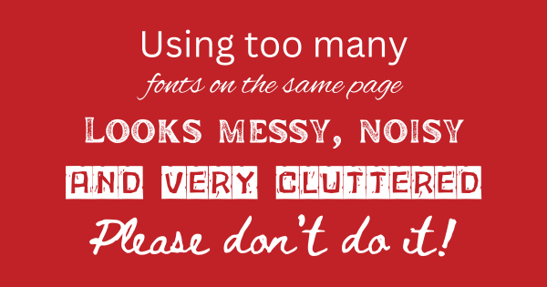
One of the most common mistakes is using too many fonts in a single design. Too many types of font makes a design look unprofessional and cluttered. Instead stick to one or two fonts while experimenting with styles and sizes. The best way is to use one serif font and one sans serif font.
Ignoring Readability
The main aim of typography is to communicate the message, so always prioritize readability. Avoid overly complex fonts or ornamentation of the fonts which can make the text difficult to read.
Not considering hierarchy
Typography plays a major role in creating visual hierarchy in a design. Use size, weight and spacing to guide the readers through the design, highlighting the title and the important information like call to action and offers.
Conclusion
In 2025, typography will continue to grow pushing boundaries of creativity. From custom fonts that give brands a unique and strong voice, to interactive typography that increases the user engagement and the revival of sans serif fonts in digital environment, all shows a shift towards more personalised and user centric design. So as we dive into the typography trends of 2025 just remember… the only “bad type” is the one that makes your readers squint… or worse, fall asleep!!