
Knock, Knock.
Who’s there?
CTA.
CTA who?
CTA, you can’t ignore – Click Me!
Well if you don’t know Call-to-Actions are the stars that guide your audience in the dark, I mean guide your audience on what to do next. They helps your audience in making a purchase, signing up for newsletters, clicking to read more content or tapping on the Call Now button! In short they helps your audience to take the next big step.
But let’s admit it, getting people to do something is a task. Don’t worry, we have got you covered! In this blog we will check out best tips for designing CTA for conversion, boosting your CTA click-through rate and increasing your CTA engagement.
Table of Contents
Before we dive into the details, let’s quickly see…
What is a Call-to-Action (CTA)?
A Call-to-Action (CTA) is usually a clickable button or link on websites, apps or digital platforms that directs your audience to your desired destination. Think of it like Doraemon’s Anywhere Door, except it takes people where you want them to go! Few popular CTA for example are:
Buy Now!
Sign Up!
Call now!

When crafted correctly it can drive higher CTA conversions which means increased clicks and sales.
Why CTA for Conversion?
CTAs drive action! Without a strong Call-to-Action your audience might be unsure about what next or worse they might leave the site without taking any action. If you are still unsure about how CTA can boost your conversions then check out the points below:
- According to latest stats, using a Call-to-Action can increase your conversion rates by 161%.
- They can create a sense of urgency, making your audience to act immediately.
- CTAs like “Get you free trial” or “Click for discounts” builds trust and promises value.
- CTAs guide the user journey, making it clear what action to take next, reducing decision fatigue.
Tips for Higher CTA conversions
Now that we know why CTA’s are important for conversions, here are a few tips to help you create a CTA that not only catches the eye but also gets clicked!
1. Get them moving – Use action words!
Action Oriented CTAs drives more conversions than Passive CTAs. Strong and clear commands remove any procrastination about the next steps, making it easier for users to understand what they should do. Think of it like, what would actually make you want to take action?
Passive CTAs like:
Click here, Submit, Learn more, or
Action CTAs like:
Grab the deal! Join the revolution! Experience it now!
2. Create a sense of urgency
The key is to make your Call-to-Action sound exciting and urgent, not like a chore. By making your CTA feel time-limited or exclusive, you create a sense of excitement and encourage faster decisions, leading to higher conversion rates. Make your audience feel like if they don’t click it they miss it! Use words like:
- Limited
- Hurry
- Only few left, etc.
3. Short & Sweet
Best CTA designs are the ones that are concise and to the point. Try limiting them to 3-4 words max. Make sure it doesn’t blabber and talks only about the action.
Click here to read more about us. NO!
Discover more. YES!
4. Colors matter
CTA button is an important button on your page. Therefore it should stand out from the rest of your page. Don’t let the button blend into the rest of your page. Use contrasting colors for the background and the CTA button. Use attention grabbing and highlighting colors like Red, Orange or Yellow depending on your brand palette.
For example, Etsy saw an increase in conversion rates by choosing orange CTAs over green ones.
5. Spot a sweet spot for your CTA
We all have a favorite side of the bed, right? Well your CTA needs its own perfect spot too. Your audience may not scroll all the way down to find it. So CTA placement should be in spots like:
- Top of the page (above the fold outperform those placed below by 304%)
- In middle of your articles or page
- Bottom of a product description page
- Centred CTAs (682% more clicks than left aligned ones)
Experiment which placement that works the best for you.
6. Test, Test and Test
Check your CTA conversions using A/B testing. It refers to a method of comparing 2 or more versions of an element. Experiment what works out the best for your website.

Test thing like:
- Button copy: Buy now vs Shop now
- Button color: Blue vs Red
- Placement: Top vs Bottom, etc.
7. Responsive CTA
A huge website traffic comes from smart phones, making it essential for your business to ensure that both your website and CTAs are responsive. A responsive CTA adapts to different screen sizes ensuring that it easily accessible on any device.
To dive deeper into the concept of responsive websites and understand why your business needs one, check out this blog.
8. Other tips
Make sure your CTA is-
- Large enough to be seen and clicked easily.
- Optimised for quick loading as slow loading can lead to users leaving the site.
- Personalise your CTA – Track and check users behaviour and personalise the CTA accordingly. For example, if someone left their order incomplete – “Continue your order” or “You left something in your cart”.
Try something new
Even though there are so many statistics showing what to do or what is better, you don’t need to stick to them! Create your own CTAs.
For example, if you are a brand that is into cosmetics and beauty products then you can use “Glow Up now!” instead of “Buy now”.
Or evoke emotions in your CTAs. Like excitement, fear of missing out or desire for self-improvement because when people connects emotionally they are more likely to take action. For example, you can:
Make a promise – Glow in a week!
Influence their FOMO – Hurry! Before it’s gone or Last chance, act now
Best Call-to-Actions
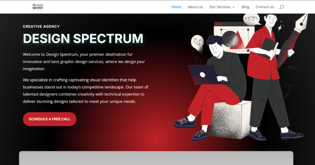
This CTA from Design Spectrum works because it offers a no-cost opportunity for users to connect, removing any hesitation about financial commitment. It also emphasizes personalized and expert advice, which encourages users to take action without the fear of hidden charges or obligations.

This Call-to-Action of Nykaa, taps into the excitement of New Year and evokes an emotion of Self-Improvement by saying “GLOW UP”. By clicking on the image, you’ll be directed to their product selection, making it easier to shop and take advantage of the offer right away. And the 50% discount feels like a major deal, creating an excitement and a sense of getting something valuable at half the price.
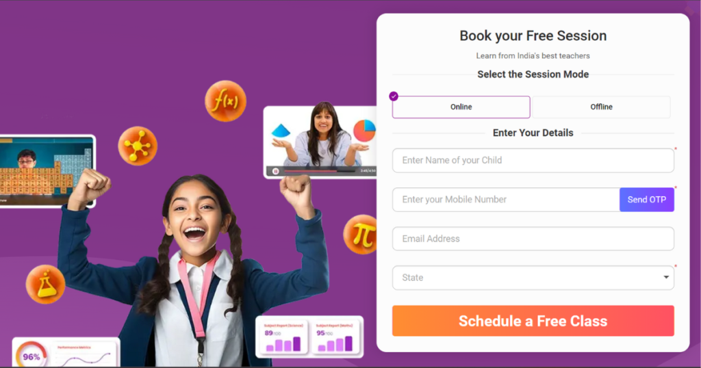
Bjyus CTA offers an immediate and no-cost opportunity to learn something you want to. The word “Free” lowers the barrier of entry, while “Schedule” conveys control, letting users pick a time that fits their schedule. It’s an effective way to build trust and encourage users to use the app without any financial commitment.
Conclusion
Crafting a perfect Call-to-Action required a balance of clarity, urgency and emotional appeal, to guide your audience to your desired action. By utilizing strategies like action words, color psychology and placement optimization, you can increase click-through rates and improve CTA conversions. The key is to test and personalize your CTAs based on your user behavior and needs.
Remember, while there are best practices to follow, innovate and inject creativity into your CTAs. A well-designed CTA can make all the difference in turning visitors into loyal customers.
So go ahead and experiment with your CTA… Happy CTA-ing!!