
You’re too happy, you switch on Spotify for some music and it plays… Party toh banti hai!!
I mean have you ever wondered how it knows exactly what mood you are in. It’s like Spotify can read your mind. Well don’t worry, it is not a creepy stalker but it’s the magic of Spotify’s UI/UX design that reads your mind like a friend without having to follow you around. Spotify app design uses smart algorithms to understand your preferences and serve the perfect track.
Spotify has transformed the music industry providing streaming, discovery of new singers and their playlist and sharing music from every corner of the globe. But what makes it different from other platforms? Spotify’s UI/UX Design is the magic behind its success.
So now that we know the secret, let’s delve into how Spotify’s UI/UX Design engages users, App interaction strategies, Personalization features and the overall user experience design.
Table of Contents
Importance of UI/UX in Spotify
User Interface (UI) is the layout and the visual elements of the app like the buttons, menu, icons, font and images. Think of User interface as literally the face of your app or website. While User Experience (UX) is the overall experience of the user when they visit and scroll through your site. Things like ease of navigation, user-friendly and page load time comes under this.
For Spotify UI/UX design is important as the app needs to be user-friendly and visually appealing to encourage the users to… “Thodi der aur ther ja” (Stay a little longer). Spotify has nailed it making it an essential everyday app in users daily life.
Spotify’s UI/UX Design:
Clean and minimalist Design
One of the first thing you will notice when opening the Spotify app is the clean and minimal look. It has a sleek and dark background which is preferred by people nowadays which also encourage less battery drainage. The dark theme is easy on the eyes and also helps the content such as albums, playlist and song titles to stand out.
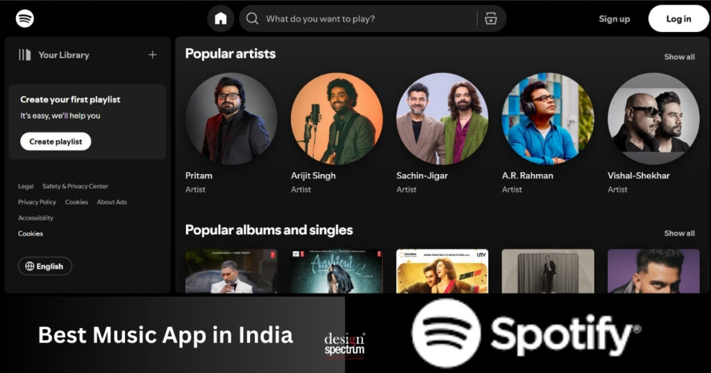
It also uses contrasting colors between the background and other elements which helps draw the user’s attention to the important elements of the app- MUSIC. The use of bold typography and large and high quality images also gives user’s an immersive and clear understanding of what they are looking at.
Despite of hundreds of millions of songs and artists, it has mindfully sectioned its layout into different categories like Artists, Albums, Hits, Devotional, etc., which allows for easy navigation helping users to find specific artists, playlists or podcasts with ease.
Your Playlist, Your vibe
Imagine you open your refrigerator which has everything you love! Just like that when you open Spotify app, you are greeted with a personalised home screen which is customised to your taste and habits. Spotify’s algorithm carefully analyses your past behaviour, songs you listen often, your curated playlists, genres you prefer and uses that data to recommend new music and playlists.
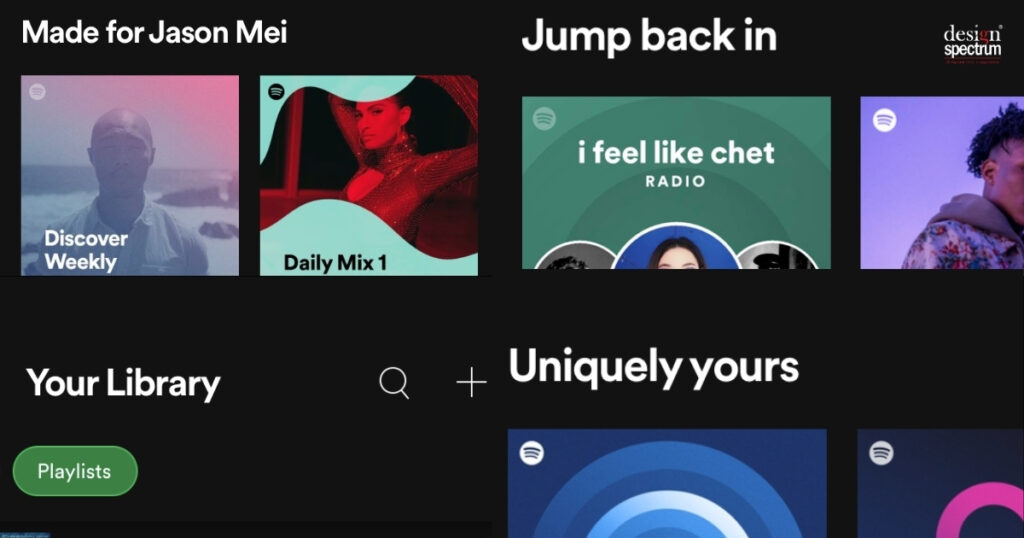
There are plenty of song options but the users might not listen half of them due to their taste and preference so instead of overwhelming the users with endless options, it strategically narrows down to individual preferences. Even the main page has sections like “Made for You”, “Recently played” and “Recommendation” which makes you feel that the app knows you.
Without overdoing anything they also kept the navigation simple. You can easily swipe through the recommendations and simply tap to listen to something new or revisit your favorite ones. And this brings us to our next topic…
Seamless navigation and interaction
Bhula dena mujhe, hae alwida tujhe… is what the users will sing if they are not able to find what are looking for. Music streaming apps is all about listening, users expect to find their saved playlist or new songs in just a few clicks. And Spotify’s UI/UX Design serves what they expect!
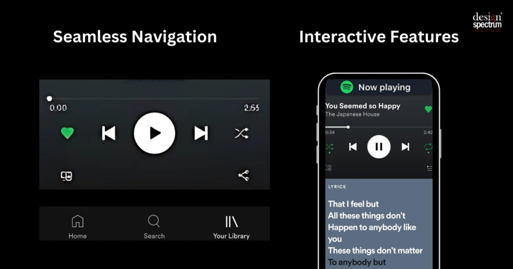
The app has intuitive navigation which is easy to understand for everyday users as well as new users. You can seamlessly switch between playlists, albums, podcasts and recommendations with ease. In the bottom it has a navigation bar with icons like Search, Home and Your library. These icons are usually what the users need more and therefore the app strategically places them in bottom of the screen where your thumb can reach easily.
You listen to a new Arijit Singh song, vibe with it but don’t know the proper lyrics yet… happens right? But we don’t have to go search for the lyrics in google because Spotify has an interactive feature called Now Playing which has Song lyrics, Songs from this album and related songs apart from the usual features like play, pause, skip and volume controls.
Discovery and functionality
Spotify’s UI/UX Design is crafted in such a way that music lovers can find the hidden gems and new songs in just a few taps. Their search bar is in the top of the home page. Its search tool integrates with its features and recommends songs based on trends, moods, genres, festival and obviously your preferences.
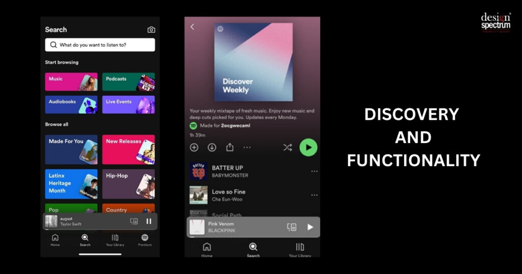
One of the most effective aspect of Spotify’s search bar is auto-suggest. For example if you are working out and need some motivational and high energy songs, the search tool will not only share specific songs but also mood and genre based options. So you can just tap into motivational songs and keep the playlist running while you burn those calories.
Apart from search, Spotify app also pays attention to new songs and new artists to help you discover them. They have features like “Discover weekly” and “What’s New” which are most loved features because it constantly updates on your listening habits and offers endless stream of fresh and new music to explore. This keeps the user attached to come and discover new songs of their preference.
Non music content – From Songs to Stories
Recently, Spotify has started exploring new stuff. It has incorporated sections like Podcasts, Audiobooks and other non-music content. It not just about expanding the app’s catalogue but about providing new and innovative ways to engage users for longer.
Spotify’s UI/UX Design integrates these new formats so listeners can easily switch between podcasts and music. But what about the users who love both podcasts and music? Well Spotify gives them an option to create a playlist which can include both songs and podcasts. This makes it engaging and increases its user-experience by being an all-in-one platform for entertainment.
Social features
Does your song preference match with your partner or friends? Spotify app’s design encourages users to connect with friends and share playlists and discover new content together. It has a feature called “Friend activity” through which users can see what their friends are listening to in real time basis. Users can then tap on the song their friends are listening to and explore.
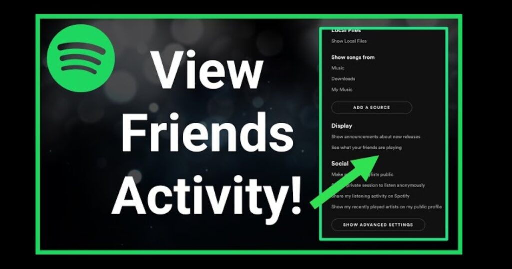
It also gives an option to share playlists and songs through social media apps like Instagram, WhatsApp, Facebook, etc. To build a connection, the app also provides an option of collaborative playlists which creates a deep connection among users and therefore with the app.
Updates and improvements
Spotify’s UI/UX Design is not static, the platform regularly updates to improve the functions and add new features to refine the overall User experience. Just like how users listen to Spotify, Spotify listens to its user and constantly adapts to meet trends and needs.
The app changes its User-Interface routinely to design the key elements and recommendation to stay fresh and provide new and updates hits and playlist. But it also maintains the familiar feeling.
Design principles
There’s a reason why Spotify is one of the best music streaming apps in the world. Design principles play a crucial role in the success of any app. Spotify’s UI/UX Design follows the key design principles like simplicity, accessibility and consistency.
Spotify has a green logo which signifies Freshness, Growth and Energy which fits perfectly into its motive of providing fresh songs, dynamic playlist and energizing experiences for users.
It has a clean and user-friendly interface for easy navigation through the content which focuses on enjoying the music effortlessly. Additionally, the app’s attention to personalization and responsive design ensures that every user, regardless of device or experience level can easily enjoy their musical journey.
Spotify Wrap-up
Another great personalised feature is Spotify Wrapped. This takes personalisation to the next level by summarizing your entire year of music. From the artist you listened to the most to the tracks that were played endlessly on loop. Spotify Wrapped serves up a personalized recap of your listening habits, creating a fun, shareable experience.
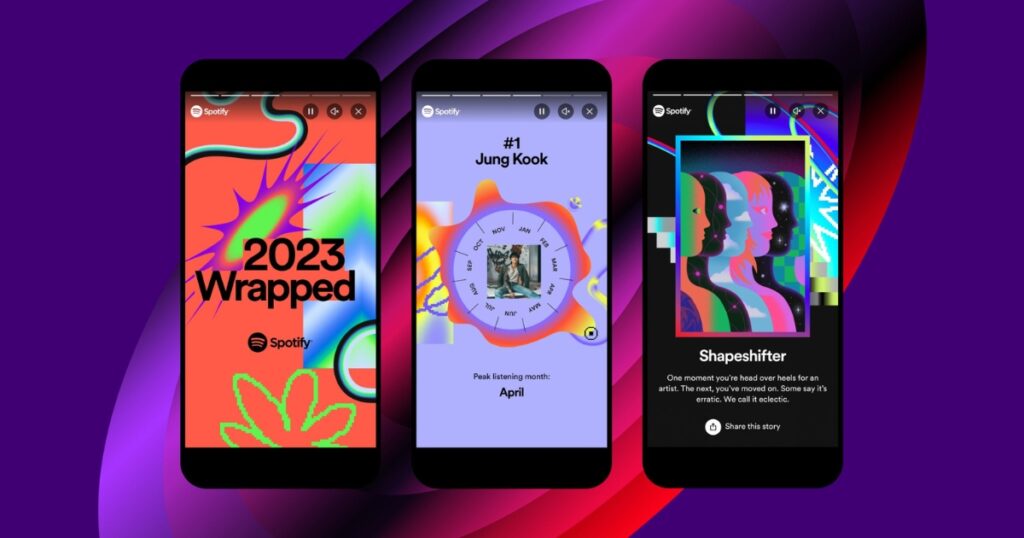
This feature is a perfect example of how Spotify’s UI/UX Design is not just about convenience but about the emotional connection between the music and the user.
Conclusion
Spotify’s UI/UX Design is the key pillar to its success. Because of its minimalist visual design to personalized recommendations, intuitive navigation and seamless integration of music and podcasts, listeners comes back singing “Tum hi ho!” Spotify’s thoughtful UI/UX design ensures a smooth, personalized and joyful experience every time you hit play.
By sticking to key design principles such as simplicity, consistency and personalization Spotify creates an environment where users can easily navigate and enjoy the content according to their preference. From intuitive navigation to smart algorithms that suggest music based on moods and preferences, Spotify’s design demonstrates the power of user-centric design in creating a platform that’s not just functional but also a joy to use.