
Trends come and go, just like people in our lives, but minimal graphic design is that old school friend who will never leave – timeless and here to stay. Minimal graphic design has been a central trend in designing for years and will continue to be thanks to its simplicity and clarity. Minimalism in design signifies clarity, functionality and sophistication. It removes unnecessary elements and focuses on what truly matters.
Be it Website design or Graphic design, the clean graphic design elements leads to better user experiences, clearer communication and an overall modern design aesthetics. However, the growing demand of minimal graphic design is not just about aesthetics, it’s about creating more functional and easily navigable digital experiences.
Table of Contents
Must Know Principles of Minimalist Design
To achieve a minimal and clean graphic design here are a few core principles you should know:
Simplicity is the heart
Remember Poonam from the movie Vivaah? The film is still loved by many because of Poonam’s simple and timeless character. The point is, minimal designs may looks simple but are the ones people remember the most. The idea is to reduce the clutter and focus on the important elements. Start with whitespace or negative space which will allow the elements to breathe, ensuring each element is given room to stand out. The use of white space and less elements help the users to focus on what needs to be seen.
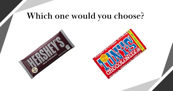
Now let’s take a look at two examples of packaging: Hershey’s vs Tony’s Chocolonely. Hershey’s packaging uses minimal text, simple and limited colors and ample white space allowing the chocolate bar itself to stand out. It’s clean and easy to recognize. On the other hand, Tony’s Chocolonely uses vibrant colors, bold patterns and a lot of text with no white space which feels so cluttered and breaks the overall design.
The power of less
Another important principal of minimal graphic design is limited selection of colors and fonts. By using limited selection of colors and fonts, you can create a sense of clarity and avoid disturbance.
Use contrasting colors for background and text, if you have a neutral-colored background opt for dark font colors and if your background is dark then use lighter font colors. This balance keeps your design clean and easy to read. Similarly use simple, legible fonts and avoid using different styles or sizes as this can overwhelm the viewer and break the design.
Focus on functionality
Minimal graphic design is not just about aesthetics but also about usability. Every element you use must have a clear purpose. Try to avoid unnecessary distractions that doesn’t contribute to the overall message of the design. Prioritize user experience by focusing on easy to navigate and straightforward design. By focusing on functionality you can create a design that not only looks great but also works seamlessly for the user.
Examples of minimal graphic designs
To understand better, let’s take a look at a few examples of brands that use minimalism in their designs or websites
1.OLA
The Indian cab-booking app Ola uses minimal design in its app and website. They have a simple user interface featuring simple icons, easy navigation and a clean layout which making the process of booking a ride quick and easy. The minimalist design helps users focus on the most essential elements such as the map, ride options and pricing.
2.MYNTRA
Myntra keeps its website and app clean and visually appealing. They focus on using high-quality images of products with clear descriptions and simple navigation. Despite having so many product categories and endless items, they have features like Find similar options, Camera search, etc through which users can find what they are looking for in minutes.
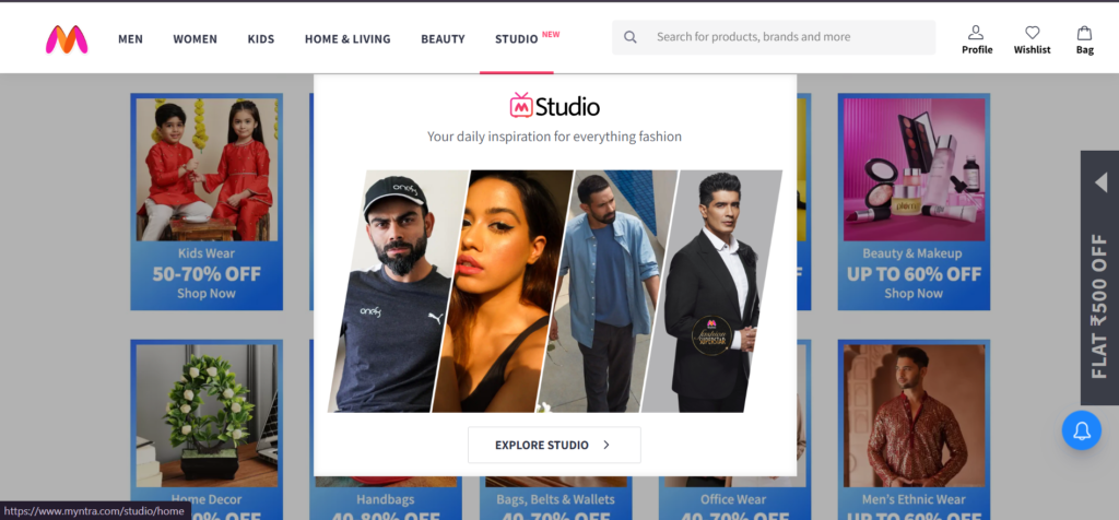
Their minimal interface, filtering options and smart features make it easy to navigate through their platform. Myntra ensures that customers can quickly compare products and make informed purchasing decisions. The overall design enhances convenience, making online shopping feel effortless.
3.MEDIUM
Talking about Medium, this blogging platform is a great example of minimal graphic design, focusing on typography and readability with minimal distractions. Its clean layout ensures that the focus of the audience remains on reading or writing content. The use of ample white space enhances the overall user experience making it easy to focus on the content without any clutter. Medium’s minimalist approach also helps foster a distraction-free environment allowing readers and writers to immerse themselves in the experience.
More example includes the global companies like Apple, Google and Nike. They have always prioritised minimal branding and simple user interface. Be it their logo, website or advertising materials all of it focuses on simplicity and clarity.
Websites like Airbnb and Dropbox focuses on clear and effortless navigation. They prioritise user experience with large images, clear typography and white space. This not only leads to modern design aesthetics but also ensures that the users can find what they are looking for with ease which reduces irritation and enhances engagement. Many successful apps adopt simplicity in design with a focus on ease of use.
Similarly our own website follows this minimalist approach with a clean, user-friendly layout that provides a seamless experience. Whether it’s a social media platform like Instagram or a productivity tool like Notion, the minimalist approach ensures that users can interact with these apps seamlessly without distractions.
Tips for creating a clean graphic design
- Creating a minimal graphic design is a process that focuses on keeping only the essentials and discarding unnecessary elements. Think of it like your airport luggage, you can carry only up to a certain limit or you’ll have to pay extra for the excess. Similarly while creating a minimal design, focus on carrying only what’s essential and eliminate anything that doesn’t add value to the overall design.
- As discussed before limiting the color palette to two or three main colors keeps the design focused. This doesn’t mean the design has to be devoid of creativity, in fact the best minimalist designs use color in a way that enhances the message.
- Additionally opt for simple, clear typography. The font you choose should be legible and complement the minimal graphic design aesthetic. Try using a combination of fonts like a serif font for heading and a sans-serif font for the body to maintain a clean and balanced look.
- Lastly be careful about the imagery you choose. In minimalist design, less is more and that applies to the visuals you use too. Go for high quality images and illustrations which align with the message of the design, obviously! Try avoiding complex and cluttered images.
Conclusion:
As the technology evolves, minimal designs will continue to grow because of their effortless adaptability on new technologies and platforms. If you are looking to create a minimal graphic design make sure to focus on the principles we explored. Examples from popular brands like Myntra, Ola, Google and Airbnb shows how minimalism has been successfully used in different industries.
Clean graphic design highlights the importance of clarity and easy navigation ensuring enhanced and increased user engagement. Whether you are designing a website, an app or a brand’s visual identity, adopting minimalism can help create visually appealing, functional and user-centric designs.
Remember – Less mess, more finesse!